Splunk Design System
Splunk Mobile Alerts
Enterprise Light Mode
Edge Processor Toolkit
PROJECT 01
SPLUNK MOBILE DASHBOARD, ALERT
The team
1 Sr.UX designer, 1 Sr. UI designer, 1 Jr. UI designer, 1 Motion designer
Responsibilities
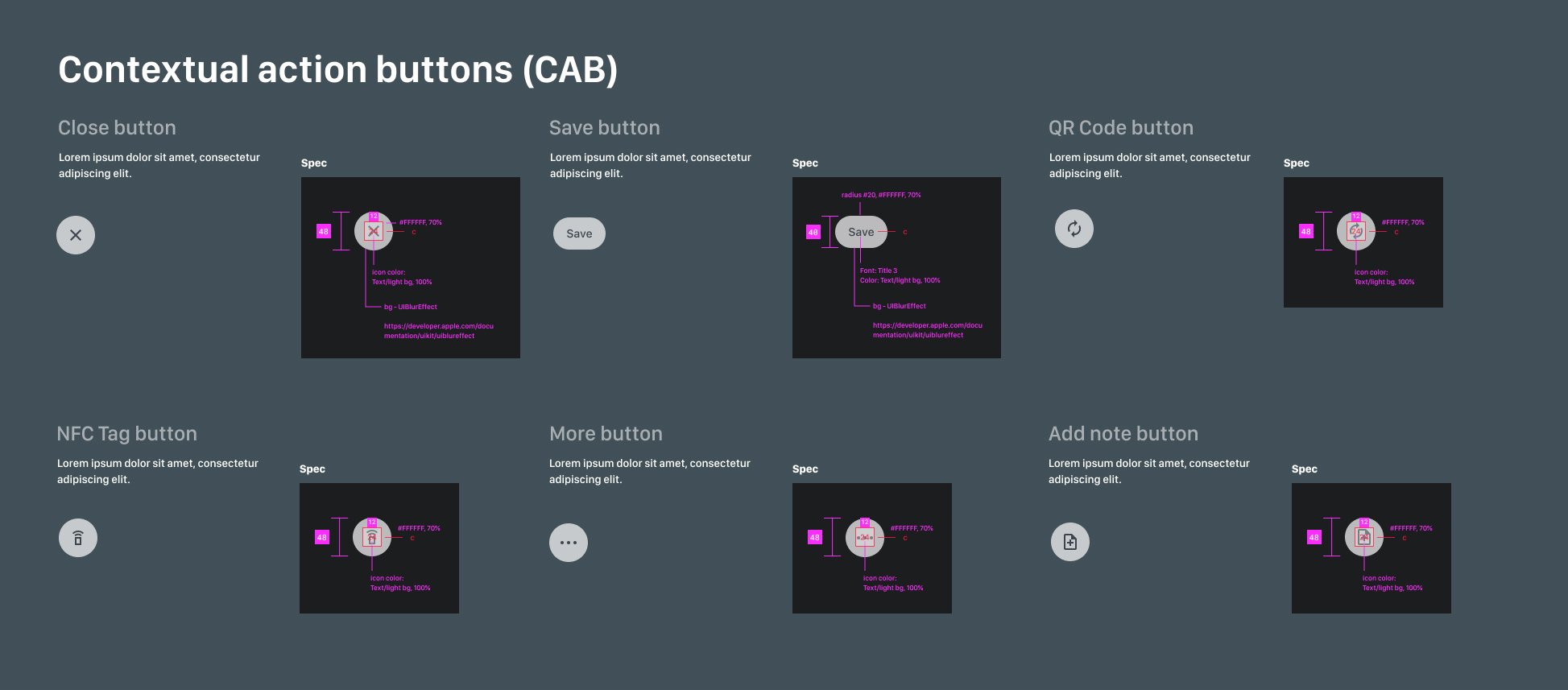
Create an intuitive visual and UI system with design standards for developing applications. Things included guidelines for each component, usages, types, icons, buttons, and screen layouts.
Timeframe
8 weeks from information structure to QA ready
CHALLENGE AND USER PROBLEM
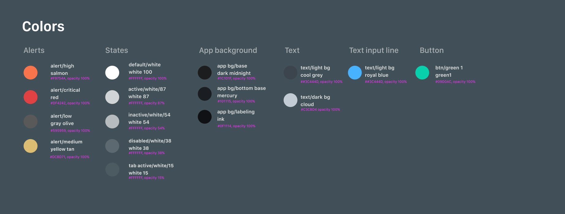
Misleading usage of color
Users get confused by branding green and CTA; green universally means complete, ready for the next step, and positive. But the current design is misleading the non-positive situations.
Design should be Intentional.
Inefficient use of space (macro space)
It takes users longer to scroll to get to the data they seek. Also, cause the user to lose train of mind
NOT designed for accessibility
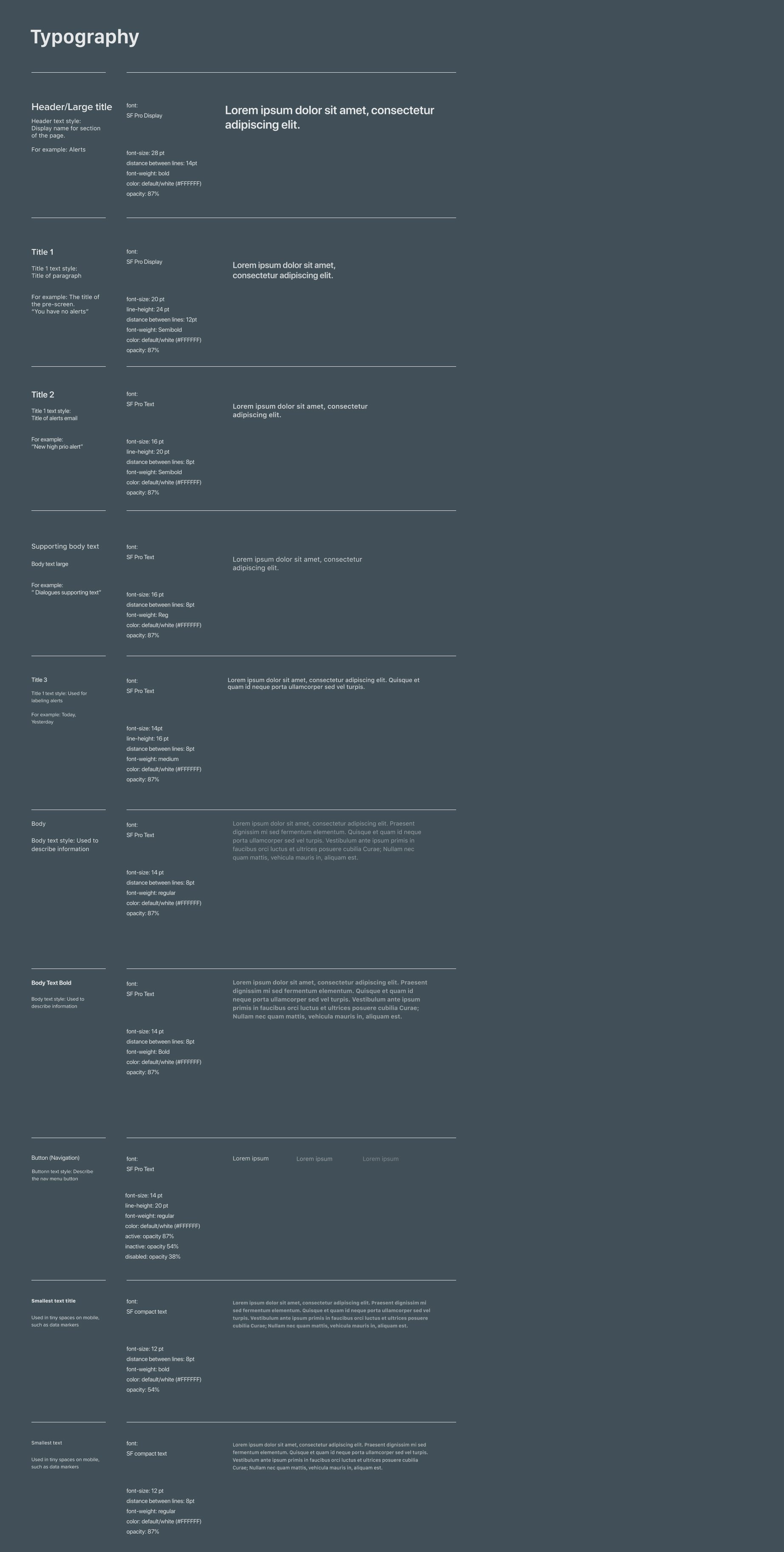
How to provide complete access to the information for everyone. The current design uses small text, lacks color contrast, small touch targets (fails for AA GAR level), and lack of talkback labels.


Enterprise Light Mode
1 Lead UX designer, 3 Part-time UX designers.
Transfer Enterprise Light Design System from Sketch to Figma. This Library support all Splunk Enterprise products.


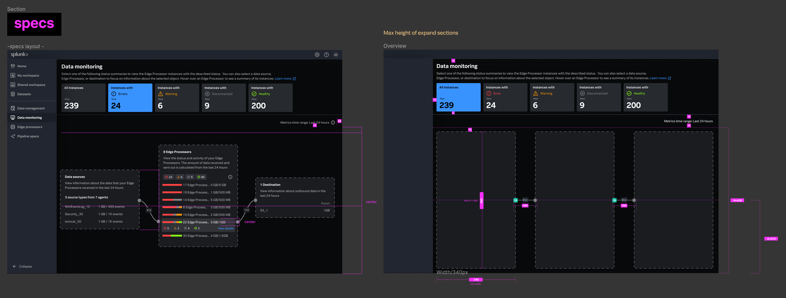
Edge Processor Design Kit
Team: 2 UX Designers, one illustrator
Created an Edge Processor Design Kit based on Splunk Design System,
The kit comes with pre-designed components and is ready to use for internal designers, the one-stop library for product design
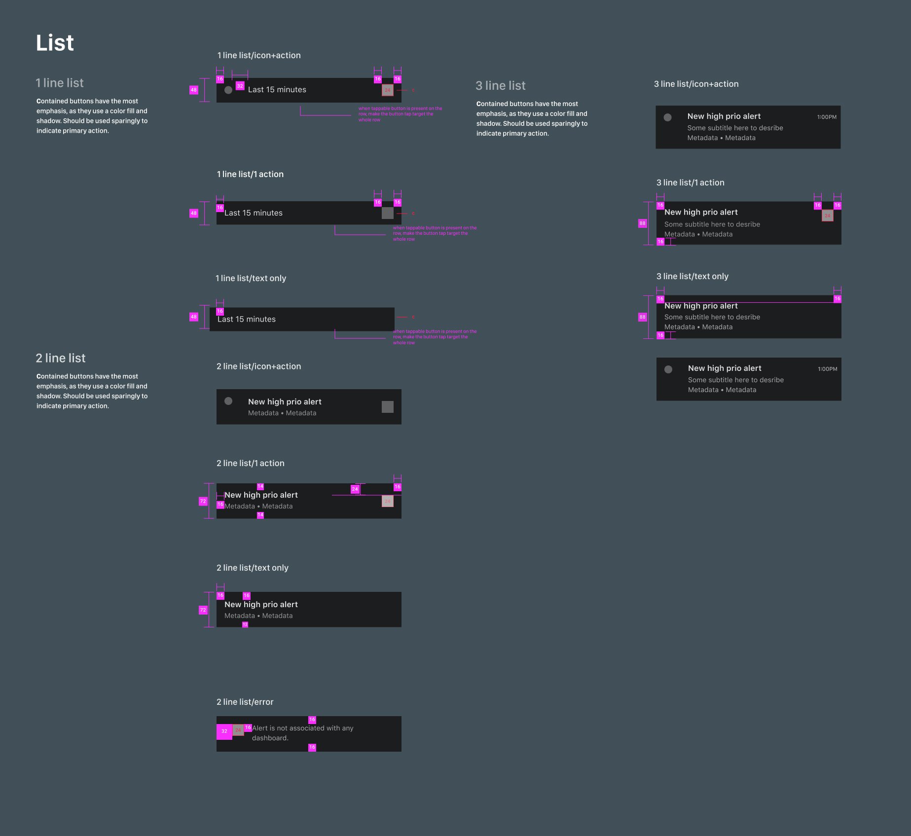
Includes: Navigation, icon & Illustrations, topology, side panels, cards, modals, tables, forms, guidelines, and redlines
Design system
In this kit, we structured and broke down each type of usage with different layers so it’s easy for other designers to find what they are looking for. Each section also has page examples to showcase how to use the components.


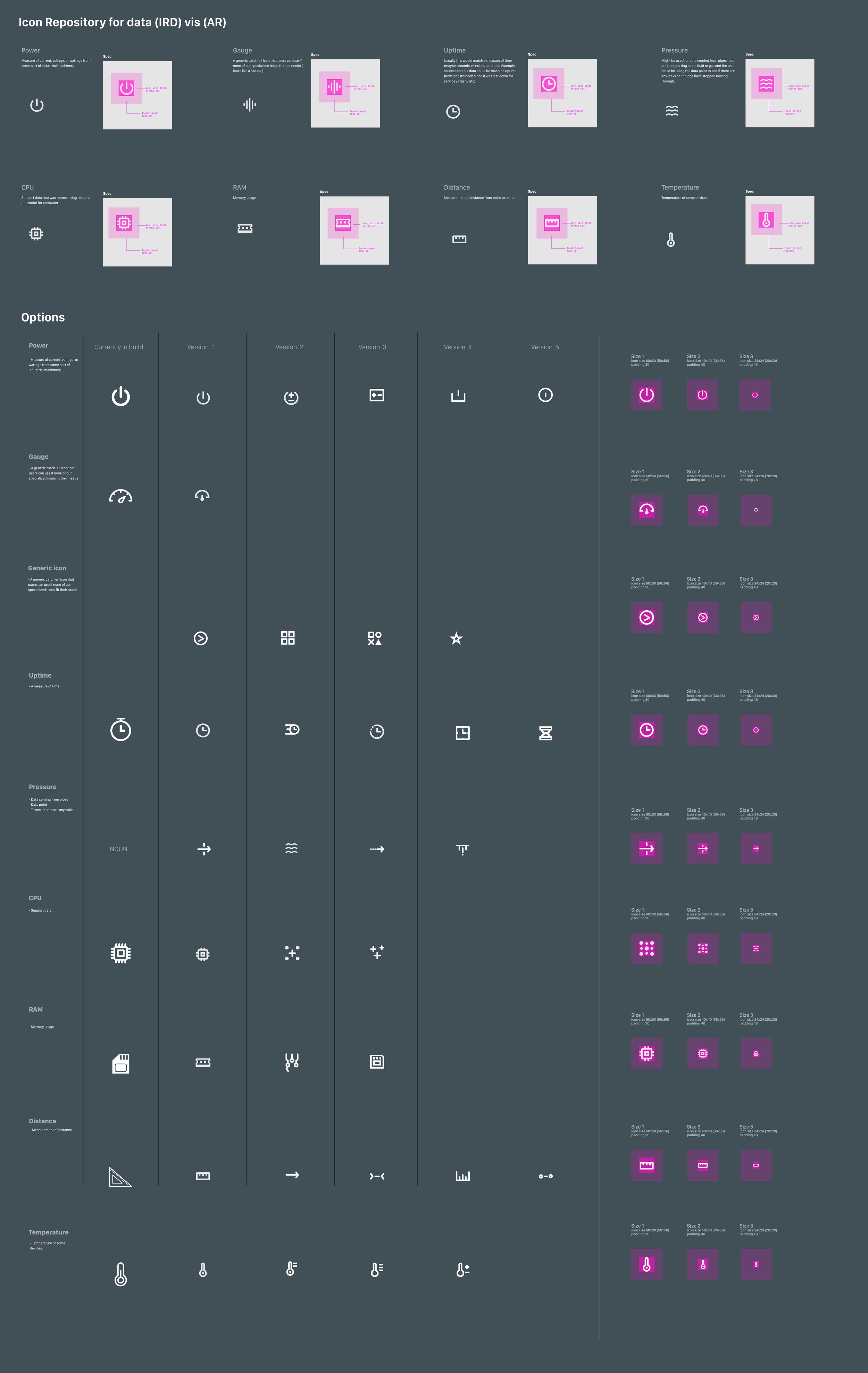
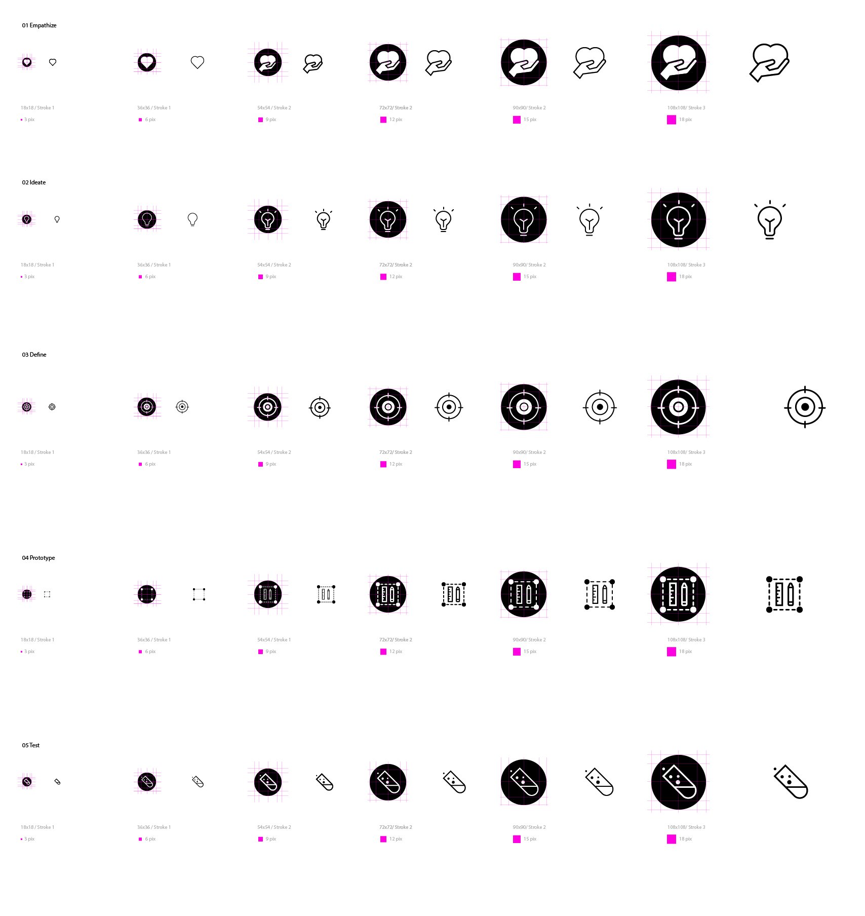
Icons for navigation on the side, and Icons for nodes and other frequently used objects
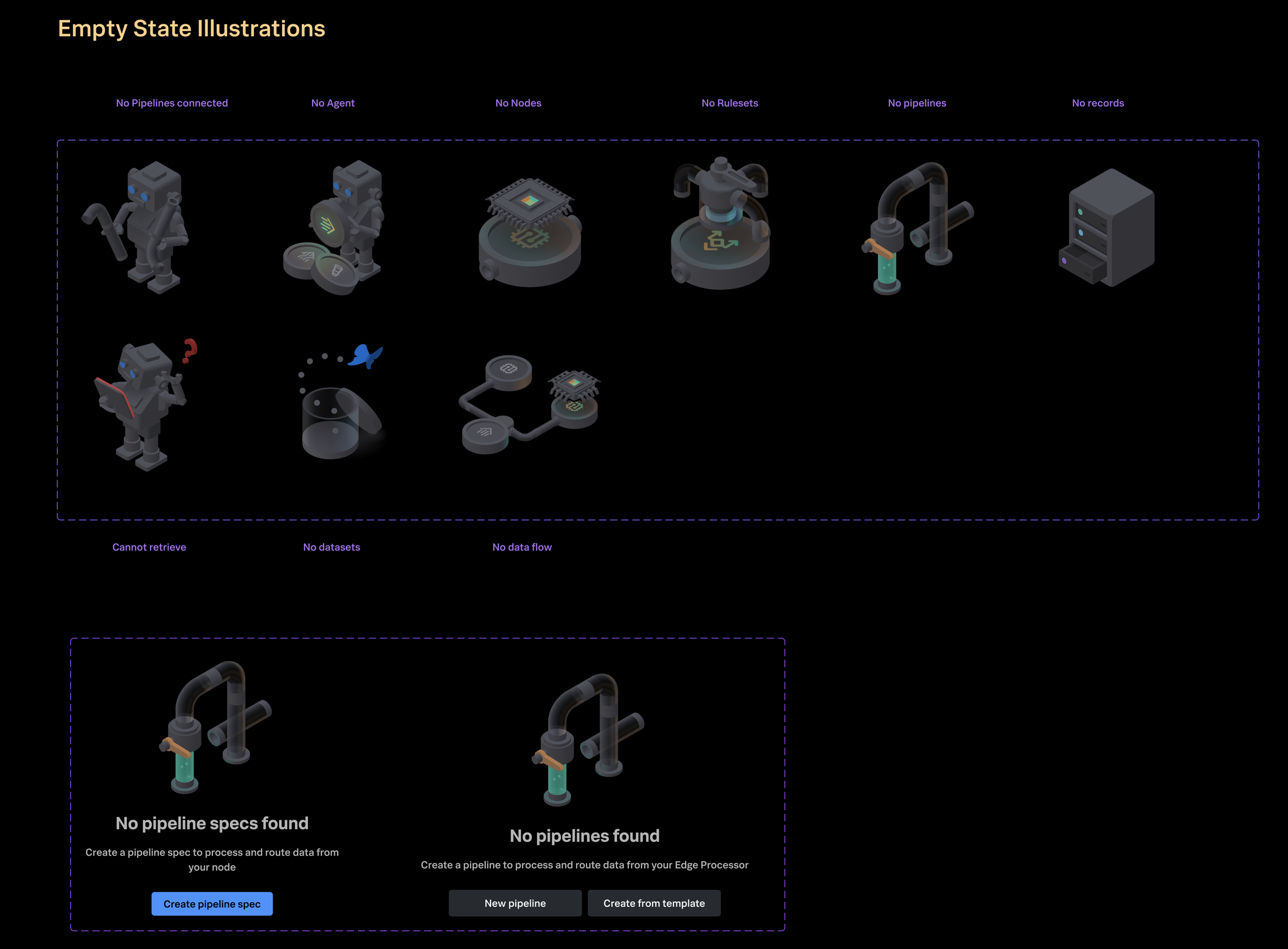
Empty State Illustrations/Status icons for node, pipeline specs, rulesets, etc.


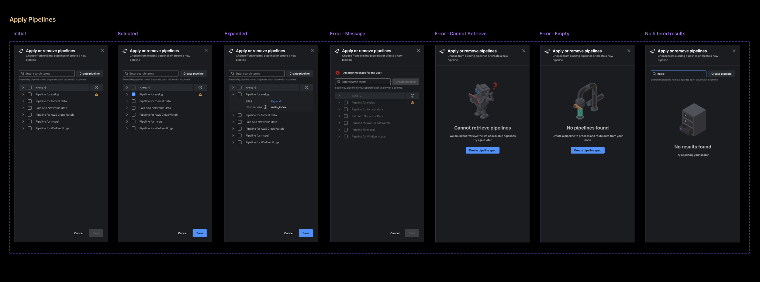
Left: Padding with responsive layout, the two panels should always ….
Right: Long SPL usecase:
Max line in the drop down panel = 6 line code
View full SPL2 text link to open an modal with full code
Max modal = 500 pix, if need more space will add scrolling bar


*Splunk copyrights all designs and graphics.