Splunk Business Flows
Splunk Business Flow is a process mining solution that brings insights to life, allowing users to explore and visualize business processes, discover connections across systems, and optimize flows. It is a fast, flexible, and intuitive solution that enables interactive discovery and investigation.
2019-2020
the team and my responsibilities
Two designers, three months outsourcing agency team (2 designers), one researcher, two PMs, four front-end engineers, three back-end engineers, two QA.
I was heavily involved in the whole life-cycle process, including crafting user workflow diagrams, storyboards, wireframes, high-fidelity mocks, and prototypes to implement from private to GA releases.
Redesign SBF phase 2 with better scalability that can handle large data volumes.
I closely worked with cross-functional teams, such as back-end engineers, to promptly improve the turnaround time for each design mock.
I worked closely with the Accessibility team to meet accessibility standards.
Conduct user feedback and improvements.


Flow Model
The Flow Model contains events you want to analyze. Users define what field names they want to track and how they want to correlate events. The Flow Model definition determines how SBF identifies and groups related events into ordered sequences called Journeys.
Why use SBF
Fast set up
Higher conversion rates of customer experiences
Reduce costs (It helps organizations make better decisions and improve operations)
It provides a centralized view of all the data
Provide hard facts as a solid basis for business decisions
Key factors
End-to-end process discovery through event stitching
Investigate drill-down with exploration interfaces/problem-solving and troubleshooting
A/B comparison process flows
Notifications/Alerts
The problems
The previous design frameworks at the time needed to be more scalable. It was only focused on the happy path.
Design components needed to accommodate new features gracefully.
The complicated navigation interface overwelled users.
Lack of accessibility
Solutions
Understood challenges and ensured the future design could integrate new features.
Designed new node/step to handle large numbers and info within limited space and an alert system.
Focused on complex scenarios with extensive data.
Used visual treatment to solve the difficult paths on the journey map.
Allowed the map to be able to zoom in on details to investigate, as well as zoom out to see the entire flow.
Broke down into an initial screen framework and organized the application into a meaningful system.
Reorganized and prioritized the toolbars and panel.
Speed up the design mock-up and review process.
Team up with back-end engineers so I can quickly plug in the design exploration process and layout into code and review in the test environment vs. mock-up on design tools which takes a much longer time
Design Development and sketches
old design
It needed better readability of the map flow, limited information on the node, and required more scalability.

The older version of the map flows.

The older version of the map flows. The node itself only had the name of the step. The random color of the nodes didn't convey a meaningful purpose.

The older version of the map flows in Lanes view.
design improvement
New Design
The Node/Step
Expanding/collapsing node groups. Color display of valuable metrics on a single visualization node with a force-directed layout can help understand high-level network structure.
*A force-directed layout minimizes overlaps in the graph, evenly distributes nodes and links, and organizes items so that links are of a similar length.


Simplified flows with grouping nodes/steps and be able to handle long text counts
Accessibility
Using the color selector tool like the WCAG (Web Content Accessibility Guidelines) shows if the selected colors pass the guideline standers.
I use colorchecker and coolors
The level AAA (enhanced contrast) requires a contract ratio of at least 7:1 for normal text.

Utilize colors that are visually associated with the content or context of each step. The red here is alert.
Example screens
Visualizing your User Journey/Flow Diagram

All steps from start to end in a journey. A web ordering system from ordering to payment to delivery.
List view with detail panel on a journey
Instance insights
List view for more profound insights into problems
Have one idea to review all transactions

Another way to see the steps is to click the List View. Here user can see what happens during each step of the process. Journey Instance view in the List feature to investigate details of an individual Journey, the user can identify the longest gap between steps and review the timeline of the Journey. They were analyzing the flow of tickets throughout a customer outage. How long did each step along the Journey take? Which attributes caused some to take longer than others?
Conversion rates/how effective is the business process

Conversion rates from start login to full scan at the end. In A/B mode, comparing Q3 to Q4, the conversion rates were from 15.54% to 98.25%. An example might be comparing sales from one region to another or reaching customer success between two products. Able to see what happened to the process.
A/B mode on Attributes of your journeys

A/B mode, compare all attributes in the journey.
Quickly see that Q4 only uses a single charge controller model but only uses little or part of the Q3.
Conf.19 demo
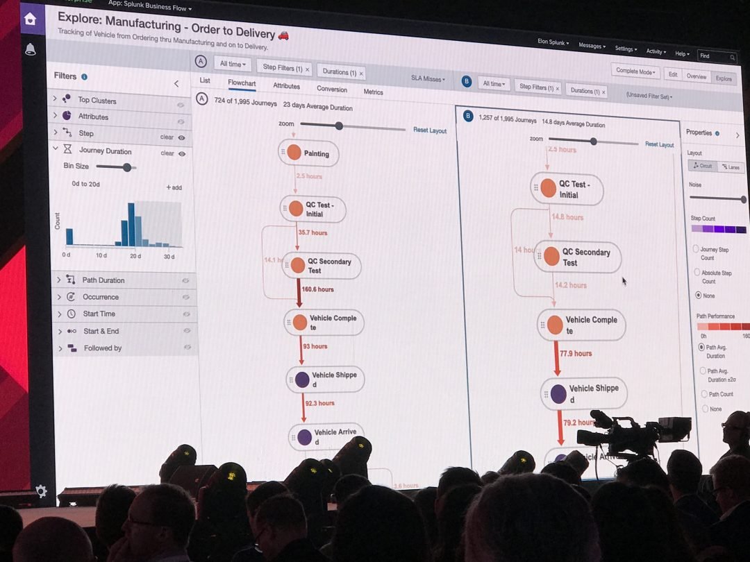
Splunk Business Flow shows developers and business professionals how users interact with their software/conf.19
A/B comparison mode shows the difference between Journey conversion rates.
*image source: cloudadvisors.net
Conf.19 demo on filter Avg. Duration

Image source: Splunk website/conf.19
The thicker and darker the path line represents, the longer the duration took from step to the next step.
Product logo
Component Library
Set of UI components including buttons, panels, alerts, color palette, etc.

Use Accessibility Checker for color contrast for WCAG compliance
All text should be legible and meet accessibility standards. The Web Content Accessibility Guidelines (WCAG 2.0)
level AA requires a contrast ratio of at least 4.5:1
Normal text and 3:1
Level AAA requires a contrast ratio of at least 7:1

User feedback 1
Users can control what they want to see under conversion, for example, add or remove steps. Inside the node, be able to handle long character counts.
Heat Map, be able to identify the blockers quickly. Hard to read when there are overlapping data.
Canvas tooling (better onboarding experience).
Explore the better way of inbound and outbound data in a visual format.
Be able to save the insights and share them with the team.
design exploration process
post ga
1. Have control to add/remove steps for insights under the conversion section
User controls what they want to see and what is important to them.

2. Easily identified blockers
Be able to easily read the overlapping Path performance and troubleshooting


Users select "Average Path Duration" or "Path Count" properties. Use opacity to show the chosen path and data.
3. Filter and view different mode
The "Mode" options (Quick, Standard, Complete, Custom) are in a dropdown next to the Overview | Edit | Explore buttons. We want to improve the information architecture by moving this selector into the Explore experience.
By doing this, the user can easily filter the data density or volume for the desired period that the user wants.


Quick Mode provides users with a quick view of how much data volume they want to view.
4. Grouping Flow Diagram tool canvas
Grouping tools by function helps with the onboarding experience. Grouping types, mode, filter, and properties.


Filters will be applied to the flowchart to visualize business processes.
Hover the filter to show the description of the filter. Click the filter, and the filter panel will appear for users to interact. When the user clicks a different filter, panel content will change based on the selected filter.
5. Property panel


6. New canvas layout with A/B comparison


New design, this A/B Compare mode, the user can compare one process flow to another. Group mode, filters, trouble shooting
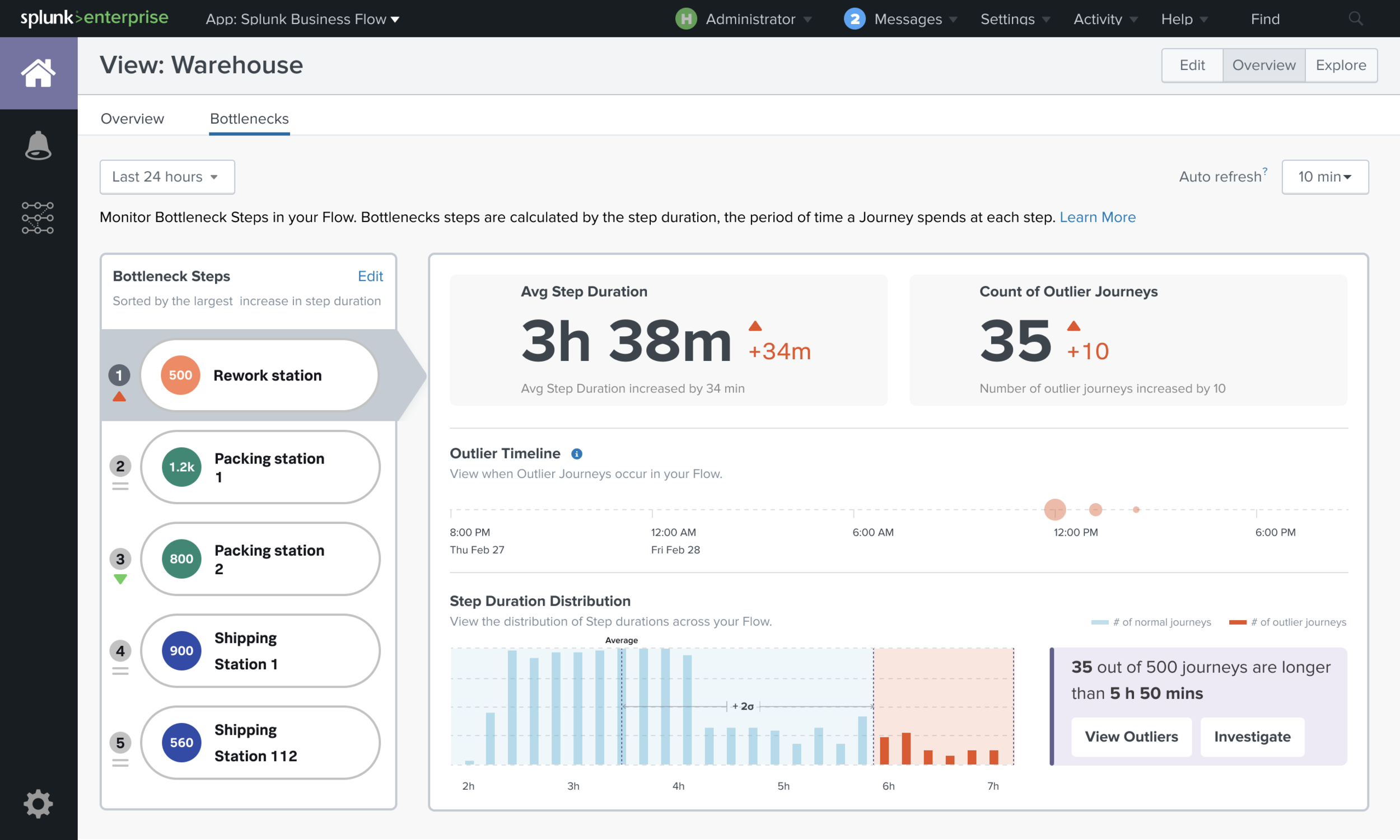
7. Charts/Bottlenecks
Monitor steps with the abnormal situation (Outliers) and when it happened from the charts. Users can see the metrics about those steps (Avg Step Duration & Count of Outliers)

Few example of chart templates.
8. Overview Dashboard
Access dashboard customization options. Users can rearrange and resize widgets or elements within the dashboard as well as create multiple columns or sections for organizing content.

9. Visual exploration of interactive filters
In this section, I worked with the UDDA agency. We tried to explore more ways of visual display multi-filtering, especially showing a clear idea of inbound and outbound data.

10. Accessibility

*Splunk copyrights all designs and graphics.